Create a bar plot visualisation from a data frame or a <summarised_result> object.
Source: R/plot.R
barPlot.RdCreate a bar plot visualisation from a data frame or a
<summarised_result> object.
Usage
barPlot(
  result,
  x,
  y,
  width = NULL,
  just = 0.5,
  position = "dodge",
  facet = NULL,
  colour = NULL,
  style = NULL,
  type = NULL,
  label = character()
)
Arguments
- result
A
<summarised_result>object.- x
Column or estimate name that is used as x variable.
- y
Column or estimate name that is used as y variable.
- width
Bar width, as in
geom_col()of theggplot2package.- just
Adjustment for column placement, as in
geom_col()of theggplot2package.- position
Position of bars, can be either
dodgeorstack- facet
Variables to facet by, a formula can be provided to specify which variables should be used as rows and which ones as columns.
- colour
Columns to use to determine the colours.
- style
Visual theme to apply. Character, or
NULL. If a character, this may be either the name of a built-in style (seeplotStyle()), or a path to a.ymlfile that defines a custom style. IfNULL, the function will use the explicit default style, unless a global style option is set (seesetGlobalPlotOptions()), or a_brand.ymlfile is present (in that order). Refer to the package vignette on styles to learn more.- type
Character string indicating the output plot format. See
plotType()for the list of supported plot types. Iftype = NULL, the function will use the global setting defined viasetGlobalPlotOptions()(if available); otherwise, a standardggplot2plot is produced by default.- label
Character vector with the columns to display interactively in
plotly.
Examples
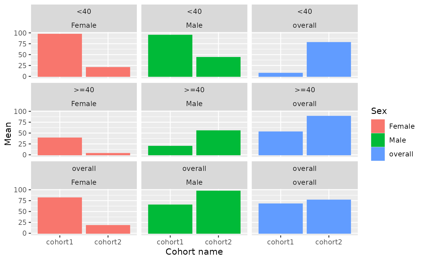
result <- mockSummarisedResult() |> dplyr::filter(variable_name == "age")

barPlot(
  result = result,
  x = "cohort_name",
  y = "mean",
  facet = c("age_group", "sex"),
  colour = "sex")